| Name | Value | Metric |
| Salah | 37 | Goals |
| Salah | 10 | Assists |
| Salah | 62 | Shots on Target % |
| Salah | 38 | Shots off Target % |
| de Bruyne | 11 | Goals |
| de Bruyne | 20 | Assists |
| de Bruyne | 58 | Shots on Target % |
| de Bruyne | 42 | Shots off Target % |
Wednesday, 4 April 2018
Tuesday, 27 March 2018
The BBC Sport Chronicles: Part 2
Anonymous
01:58
data viz, dataviz, football, makeover, soccer, visualisation, vizualisation
No comments
![]()
Drawing from this article by Phil McNulty (http://www.bbc.co.uk/sport/football/43463551), there is a section where McNulty focusses on the conundrum around England goalkeepers, and who should wear the number 1 jersey at the World Cup.
And as part of this piece, was this wonderful bar chart;

The data is from opta, and each goalkeeper is grouped by the relevant number used. However;
- How easy is it for me to compare the goalkeepers for clean sheets?
- How easy is it for me to remember which colour bar refers to which metric?
- What is the takeaway message here?
| Metric | Player | Value |
| Appearance | Butland | 27 |
| Clean sheets | Butland | 5 |
| Goals conceded | Butland | 49 |
| Appearance | Hart | 15 |
| Clean sheets | Hart | 3 |
| Goals conceded | Hart | 33 |
| Appearance | Pickford | 30 |
| Clean sheets | Pickford | 7 |
| Goals conceded | Pickford | 49 |
| Appearance | Pope | 27 |
| Clean sheets | Pope | 10 |
| Goals conceded | Pope | 22 |
Sunday, 31 December 2017
Reflections: 2017
Anonymous
19:18
No comments
![]()
2017 is coming to a close, and I wanted to break my blogging hiatus to reflect on the last 12 months.
Working abroad
One of the best parts of the Data School was having the opportunity to not only work in the UK, but also abroad - and I was lucky enough to spend my final placement working between the UK and mainland Europe. The experience was really good fun, and the work exposure was awesome. I learnt about the trials and tribulations of working remotely, and across time zones - something I again was able to do later on in the year.
I also met these fun dudes while wandering around.
In fact, personally & professionally it’s been a fun year - I’ve visited 8 countries in total (OK, this list also includes Scotland…)
Uncharted territory
However, learning from JMac, I got more and more involved with Tableau Server - and I’m proud to say that between April and December, I pushed myself to pass both the Tableau Server Qualified Associate exam AND the Certified Professional exam. If you’d told me this on the 31st of December 2016, I probably would have laughed - Servers were a field and a concept I was alien to.
Marry this up with passing the Tableau Desktop Certified Professional exam, boom - I’m fully Tableau Certified! This is one of my biggest achievements of 2017.
Expeditions & conferences
I also was able to attend the Tableau Conference in Las Vegas this year, sandwiched between some travelling of the US - a bunch of us from DS1 road tripped across from Oakland to San Francisco, down to spend a few nights in Yosemite before driving through Death Valley to Las Vegas. The trip ended after the conference, where we spent some time around the Grand Canyon.
 It was stunningly beautiful and super fun - and the Conference did not disappoint. Meeting & conversing with a vast range of people enthusiastic with Tableau was awesome, and developing my own knowledge was incredibly useful. My highlight, though? Meeting and speaking with Devs. Simply awesome.
So what’s next?
I’m never one to goal set across a long period of time - because both personal and professional life is fluid - but guidelines can be fun. And my only guideline to myself is to continually reinvent & develop my own skillset and knowledge. And of course, have a ton of fun on the way.I hope to pick up my blogging routine and branch out across other media - and most importantly share more about my ideas for Tableau, for Alteryx and as much as I can in this space (with some room for sports analytics, of course)
I hope you, Reader, the very best health, wealth and happiness for 2018!
Thursday, 19 October 2017
Why your understanding of ‘elite mentality’ is false, and how data can help solve this problem.
Anonymous
16:10
data, elite mentality, football, soccer
No comments
![]()

In recent years, there’s been a rise in the usage of the term ‘elite mentality’ - particularly in the world of football (soccer). The application, in the way the term is used, is to describe someone who is a good player, but not ‘elite’ because they don’t have a winning mentality. This is measured by the number of finals they’ve won, and medals they have etc etc yada yada yada.
I disagree.
Like big time.
Cavani, Higuain, the Argentinian national team, Tottenham Hotspur… often are often all called bottlers who don’t have this “elite mentality.” Players who aren’t good enough; aren’t champions; aren’t
Poppycock.
Sport is about winning, ultimately. But sport is wonderful, beautiful and engrosses billions. And for many, an “elite mentality” is where a player, individual or team are able to win regularly, consistently and in style.
However - If an elite mentality exists, in my eyes, and perhaps even in a coach or even player/ex-player, it doesn’t come from what you win. It comes from how you grow through your career.
Goal Setting
[‘Big Brother’ surveillance in elite sport is pushing a culture with a machine mentality](http://theconversation.com/big-brother-surveillance-in-elite-sport-is-pushing-a-culture-with-a-machine-mentality-34214)/2012%2F12%2F04%2Fe0%2Fsurveillanc.b8u.jpg)
The above article talks about how surveillance is focussing on tiny flaws to ridicule managers. This is of course a by-product of any data - that with the right context or framing, it can be used to push a certain narrative.
But data can be incredibly useful - particularly when it can enable sports professionals to begin to quantify the unquantifiable - which in turns adds another layer of information to consider when diving into player or team analysis.
Let’s take an example.
I am a coach of a professional football team’s academy, and I have 6 players I’ve earmarked for progression into the first-team. But all have flaws.-> The striker attempts to dribble for as long as possible and usually ends up being dispossessed due to trying flair moves
-> The wide midfielder in my academy enjoys cutting inside and shooting speculatively, rather than looking for the pass.
-> The central defender always thumps it clear, rather than starting an attack.
All of the above can be coached, but with the emergence of data, this progress can be tracked to see which of these players possesses the mentality & hunger to continually progress.
By this, I mean a player who not only is looking for coaches to tell him his strengths and weaknesses, but is one who will consistently and constantly look to improve.
Data can be combined with human coaching to show a player situations where they should change their decision making process, and even for coaches highlight areas where approaches can be gamified in training sessions.
Get the first player to pass at least twice and show him the value he can bring when 1-on-1 with more space to exploit.
Coach the second player to think twice before letting fly with the rocket, with a ‘points’ related coach (merits for ‘good’ locations, demerits for ‘less good’)
Work with the third player to improve their own the ball confidence and technical ability.
Talent Identification (TID) is the intricate art of wanting to use data to help highlight the right time to bring a player through the ‘funnel’ to first team football. Based on precedent, it’s then possible to build an understanding of what key factors are in tagging development, and how to best nurture talent.
Harry Kane
The strange rise and rise of Harry Kane was highlighted by the contrasting views - on one hand, you had the Kane hype train which was highlighting the second coming of a true world class striker; the others were saying it was a freak season due to the previous ‘failings’ of the striker on loan spells at Norwich, Leyton Orient and Leicester.
But amongst these loan spells, coaches spotted something in his game which they wanted to nurture. If you recall, Kane often started as a CAM, as well as a CF when he came through the academy - which is strange now looking back given his propensity to be a baller when it comes to finishing chances.
How can we find players with Kane’s mentality? Who have a hunger to develop, and which cannot be spotted in their on-field outputs, but simply from their responses to coaching, viewing how they apply recommended changes and their drive to improve.
What can clubs do now?
A super duper smart analytical approach will combine the expertise, experience and nous of a coach/scout with the vast amounts of data being collected in order to learn to be smarter with decision making.Are there markers to help spot talent?
Can training session events be logged, and used in tandem with on-pitch output to track progress toward goals?

How can the qualitative match the quantitative to improve conversations had internally? Can this ensure a club doesn’t pay over the odds for an average player by simply bringing a existing expertise together with existing data?
The dream, as they say, could be getting to a level of data and competence where key markers are used to time purchases of players to capture the upward peak of their career.
Now that would be elite.
Monday, 10 July 2017
Visualisations in the Wild - Sky Sports can do better
Anonymous
14:59
dataviz, football, makeover, sky sports, soccer, visualisation, visualization
No comments
![]()
Player
|
Mins
played
|
Shot
conversion %
|
Goals
per 90 (exc. Pens)
|
xG per
90 (exc. Pens)
|
Lacazette
|
2,408
|
33.3%
|
0.67
|
0.47
|
Sanchez
|
3,223
|
18.6%
|
0.61
|
0.42
|
Giroud
|
1,194
|
30.8%
|
0.9
|
0.51
|
Walcott
|
1,925
|
16.1%
|
0.47
|
0.36
|
Welbeck
|
746
|
10.5%
|
0.24
|
0.38
|
Perez
|
265
|
11.1%
|
0.34
|
0.27
|
Iwobi
|
1,462
|
7.69%
|
0.18
|
0.18
|
Thursday, 29 June 2017
Hey, where'd that 'Style Guides' series go?
Anonymous
11:06
data viz, dataviz, style guide
No comments
![]()
I've been super lax about blogging over the last year or so.
OK - explain.
Is there room for both?
Monday, 26 June 2017
Long-form Tableau Visualisations - The New Normal?
Anonymous
17:18
annotations, chartjunk, dashboard, data, data viz, dataviz, iron viz, ironviz, long form, shape, tableau, tufte, visualisation
No comments
![]()
I've never made it a secret. I'm by and large against the principle of long-form visualisations.
My reasoning has been that while they're very useful to simply scroll through as an image on a mobile, there's a lot to consume when viewed in browser.The hashtag #saynotolongform which I've sporadically used is designed to be provocative - There are some excellent examples of long & thin dashboards. But for me, this is sparking a real change in the way that the construction and consumption of this format - particularly on the side of a designer. And increasingly it's "data visualisation" which has taken the back seat with a more 'poster' style of dashboard taking the lead.
Edward Tufte talked about the data-ink ratio, but perhaps a new phenomenon with the rise of long form visualisations in Tableau is the data to image ratio.
Lots of logos, images, shapes, custom lines, fancy borders/background images are married to stunning colours to create some simply gorgeous visualisations. But a lot of the information ends up being hidden in text; either with BIG STATEMENTS, large numbers or just integrated in descriptions.
The visual analysis which Tableau champions, where bodies of text and tables are replaced by the 'right visualisation for the message' - is this slowly disappearing in the public space, in favour of eye candy?
Money where my mouth is
So in lieu in finding out (if you excuse the phrase) how the other half live, for the Iron Viz Europe feeder contest I actively decided I wanted to create a long-form visualisation. And perhaps it showed why I wasn't a fan, as I really didn't enjoy the experience of building one. I've also sometimes found that some long-form visualisations are designed in such a way that when scrolling, I can forget or lose the underlying message - or worse, the story or the message that I thought a visualisation was telling is not the one the author is allegedly attempting to convey.I feel as though, if Tableau are going to feature and focus upon long form visualisations in the public sphere, perhaps there should be an effort to also make it easier. This said, there's also scope I think for some developments on dashboarding in general, and updating this to fit the use cases people use Tableau for - both as part of their day-to-day jobs as well as for data hobbyism.
The interesting thing is that long-form seems to be something which has ramped up in the last 12-18 months - perhaps even coinciding with the 'Device Specific Dashboarding' feature which dropped along with Tableau 10.0 - And while I can see it's benefit for a mobile viz, I'd even go as far to say that I am yet to see a fantastic mobile dashboard, with rich amounts of analysis, insight & a clear story (And please, if you're reading this post, do send me your favourite long-form vizzes, and why you like them!)
But designing for the medium of consumption is something which is absolutely must be considered. This is where I feel that 'dashboard design' in itself, is not a skill. It's a part of a wider collection, and I think we as a community should stop using it as a blanket term for specific data visualisation decisions made with purpose. The current connotations just seem to be pure 'design' related, than about good dashboarding, especially when it comes to different approaches to storytelling.
Championing Long-Form
I think the difficult part of the Iron Viz contests is looking beyond the aesthetics of a visualisation (by this I mean using a lot of colour, text & images to assist/add context to the data) and focussing on analysis. This is where I think the data to image ratio comes into play - tables of data have now been replaced with text, large bold statements & other image-based clutter.Indeed, design comes as one of the 4 sections that's being measured by the Tableau Public team - Design, Storytelling, Analysis & Overall Appeal being the categories - but it seems as though there's been a shift, or even a skew by the dashboard designers in the Community to use long-form to emphasise the design aspect, perhaps even more than the data visualisation.
Why is this?
In my mind, the reason for this is essentially because of the 'storytelling' section of Iron Viz. With over 60 entries for the first Iron Viz feeder, in order to stand out it can almost become a pre-requisite to create a visualisation which has a lot going on. By this I mean a dashboard which follows the 'flow' of a story, which each 'section' getting small nuggets of analysis.Indeed, while browsing through the entries this morning, I noticed a few which had 2 charts on the dashboard. While I understand & am an active fan of 1-chart dashboards, my view is that the annotation layer (this post is great on this topic) should drive the storytelling.
What is the limit? When does it become a problem to have more images & headers over insight into datasets?
From 2 charts/sheets/views to 10-15 on another entry - is that an overload? Whereby in order to tell a compelling story, multiple charts need to be used just to 'add' more data visualisations, and have something to support the text?
Clutter is still the devil.
If 'dashboard design' IS a skill, then where does the ability to hold a narrative and not overly clutter come in? This brevity and ability to be concise is perhaps even more important than having a beautiful, colourful visualisation.
Perhaps this is an indicator to uphold a strong narrative the 'one screen' which I read - but my question is - is adding this level of 'scrollytelling' taking 'one screen' a bit too far? Should each segment of analysis be done using tabs instead? (Not story points, as I think this feature needs a bit of work - but that's for another post!)
The right tool?
One of the most brilliant things about Tableau is the simplicity to create something - it's quick, intuitive & once you 'get' the software, there's a lot more depth you're able to bring in. However, I've seen a few members of the Tableau community start dabbling with d3.js - which I think does scrollytelling correctly; the marriage of text and visualisation works well when it's integrated in the user experience - the first chart on this visualisation is a case & point of that.So what's next?
I absolutely don't think that this trend will slow down at all.The process of designing something 'beautiful' is inherently linked with long-form visualisations, because of the real-estate given to add a whole host of elements. However, this also means the shift away from some of what I believe to be core Tableau concepts - the championing of data visualisation, the ability to have some - but not total - design control.
What I ultimately want to do here is start a conversation. Given the statements and assertions I've made above, I want to hear more about what the community think - particularly on where this is going & whether it's something which should be discussed more.
As always, I welcome all thoughts, feedback & challenges - Comment, or get in touch! I would love to chase this down the rabbit hole further.
Friday, 23 June 2017
The Data School: 2 years on
Anonymous
09:30
No comments
![]()
On the 23rd of June 2015, there was a spark in Central London.
And two years later, this spark is now a burning flame, which has been a roaring success.
I am, of course, talking about the Data School.
An idea started by Tom Brown, Craig Bloodworth and (perhaps the most important piece of the jigsaw) Andy Kriebel ended up in eight complete strangers taking a leap of faith and joining an immersion programme like no other. It promised four months of training in two market-leading data analysis applications, followed by 18 months of consulting at clients of the Information Lab.And it worked.
It really, really worked.
Quantify This.
5 cohorts trained (DS6 are currently in training)
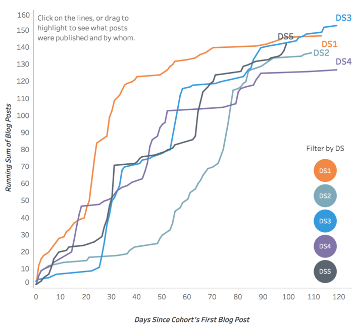
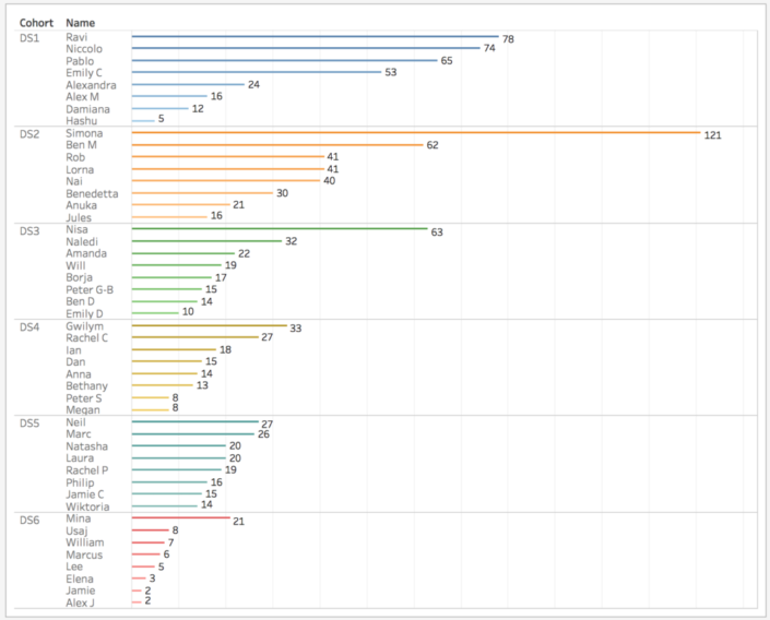
702 blog posts
1238 Tableau Public vizzes
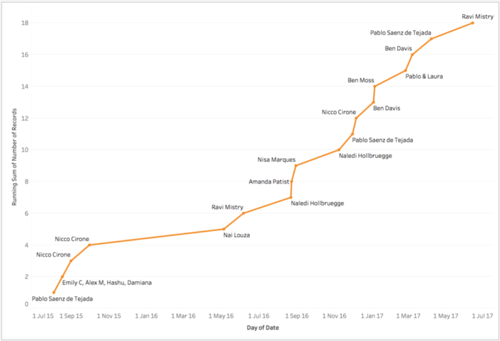
18 Viz of the Days
4 Tableau Ambassadors
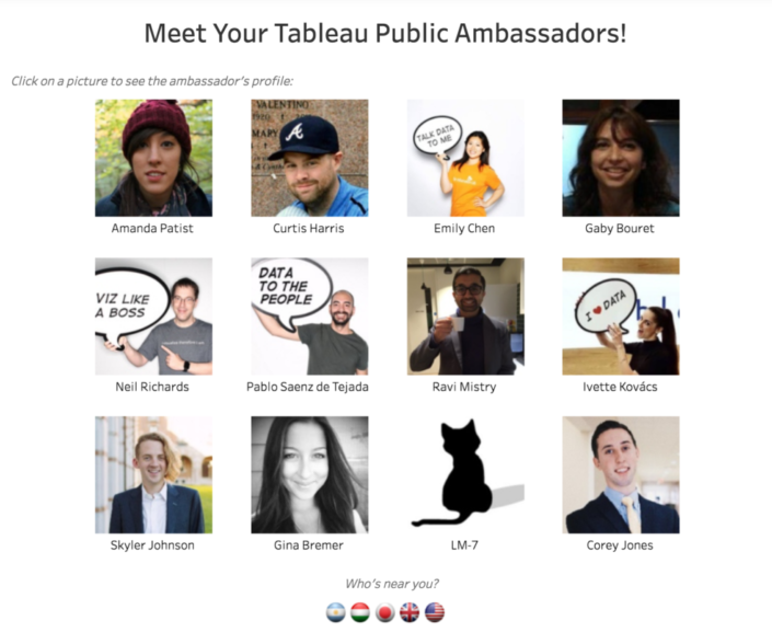
The Experience
For me, coming out of university, I had no idea of the size and impact that the Data School would have. In fact, Tableau was simply a tool which made my soccer charts look better, and made them more dynamic. Anything more than that (I thought at the time) involved some crazy coding - so I endeavoured to up-skill in the summer after university anyway, but in the end I was lucky enough to be offered a job with The Information Lab.Between the numerous client projects, the public presentations (I've now done 7 public presentations - 3 webinars and 4 in person live) and the amazing expansion of my personal and professional networks, the opportunity to work and consult with the Information Lab has been great. My three placements were at BCG, Deloitte and Novartis (who are based in Switzerland!), and each experience lent itself to another learning experience.
At BCG, I built, ran, and developed training materials whilst balancing case work where we supported consultants. At Deloitte, I experienced the breakneck speed of being part of a consulting team with hard deadlines, iterating on the fly. At Novartis, I learned about strategically building out a Centre of Excellence, and supporting the development of enterprise scale rollouts of both Tableau and Alteryx, as well as the challenges that come with that.
And alongside all of this, the continued personal development, time management and extra-curricular activities have been paramount to getting me where I am and making me who I am today.
The best part? From day 1 with the team, I was assigned Brian Prestidge as my mentor - a true gentleman who spent nine years working in football using Tableau and Alteryx. The soft skills, application, and anecdotes from him were fantastic, and the opportunities which came from sharing my interests also helped my development. I attended two OptaPro forums, and developed my own style of sports dashboards which are both informative, beautiful, and applicable to different audiences, and of course, who can forget the Data School's #TeamIago who attended Hack MCFC.
Now.
Since finishing the Data School, I was lucky enough to be offered the opportunity to join The Information Lab as a core consultant. How has this changed what I do day to day?In all honesty? Not all that much. I'm still consulting with clients, but instead of one client for six months, I'm working with three clients in a week, six in a month etc. It's a really fast-paced role, and fortunately there's still the opportunity and time for more learning. In fact, I think I've learned so much in the last couple of months, purely given the wide breadth of clients I've worked with, as well as having the time allowed to reflect and develop.
My final thoughts are this; in June 2015, along with eight strangers I embarked on a two-year journey.
At the end, I've gained friends, colleagues, and the job of a lifetime - and it's just the start.
A particular highlight is where I found myself, in the middle of July 2015 sitting working on a client project, or a dashboard and thinking - hey, three months ago, I was doing this for fun.
Now it's my career.
The Data School; 2 years on.
Anonymous
09:00
No comments
![]()
On the 23rd of June 2015, there was a spark in Central London.
And two years later, this spark is now a burning flame, which has been a roaring success.
I am, of course, talking about the Data School.
An idea started by Tom Brown, Craig Bloodworth and (perhaps the most important piece of the jigsaw) Andy Kriebel ended up in eight complete strangers taking a leap of faith and joining an immersion programme like no other. It promised four months of training in two market-leading data analysis applications, followed by 18 months of consulting at clients of the Information Lab.And it worked.
It really, really worked.
Quantify This.
5 cohorts trained (DS6 are currently in training)

702 blog posts

1238 Tableau Public vizzes

18 Viz of the Days

4 Tableau Ambassadors

The Experience
For me, coming out of university, I had no idea of the size and impact that the Data School would have. In fact, Tableau was simply a tool which made my soccer charts look better, and made them more dynamic. Anything more than that (I thought at the time) involved some crazy coding - so I endeavoured to up-skill in the summer after university anyway, but in the end I was lucky enough to be offered a job with The Information Lab.Between the numerous client projects, the public presentations (I've now done 7 public presentations - 3 webinars and 4 in person live) and the amazing expansion of my personal and professional networks, the opportunity to work and consult with the Information Lab has been great. My three placements were at BCG, Deloitte and Novartis (who are based in Switzerland!), and each experience lent itself to another learning experience.
At BCG, I built, ran, and developed training materials whilst balancing case work where we supported consultants. At Deloitte, I experienced the breakneck speed of being part of a consulting team with hard deadlines, iterating on the fly. At Novartis, I learned about strategically building out a Centre of Excellence, and supporting the development of enterprise scale rollouts of both Tableau and Alteryx, as well as the challenges that come with that.
And alongside all of this, the continued personal development, time management and extra-curricular activities have been paramount to getting me where I am and making me who I am today.
The best part? From day 1 with the team, I was assigned Brian Prestidge as my mentor - a true gentleman who spent nine years working in football using Tableau and Alteryx. The soft skills, application, and anecdotes from him were fantastic, and the opportunities which came from sharing my interests also helped my development. I attended two OptaPro forums, and developed my own style of sports dashboards which are both informative, beautiful, and applicable to different audiences, and of course, who can forget the Data School's #TeamIago who attended Hack MCFC.
Now.
Since finishing the Data School, I was lucky enough to be offered the opportunity to join The Information Lab as a core consultant. How has this changed what I do day to day?In all honesty? Not all that much. I'm still consulting with clients, but instead of one client for six months, I'm working with three clients in a week, six in a month etc. It's a really fast-paced role, and fortunately there's still the opportunity and time for more learning. In fact, I think I've learned so much in the last couple of months, purely given the wide breadth of clients I've worked with, as well as having the time allowed to reflect and develop.
My final thoughts are this; in June 2015, along with eight strangers I embarked on a two-year journey.
At the end, I've gained friends, colleagues, and the job of a lifetime - and it's just the start.
A particular highlight is where I found myself, in the middle of July 2015 sitting working on a client project, or a dashboard and thinking - hey, three months ago, I was doing this for fun.
Now it's my career.
Monday, 1 May 2017
Iron Viz Europe: Changing Demographics Across Europe
Anonymous
13:38
ageing population, dashboard, data viz, demographics, eu28, europe, iron viz, ironviz, tableau, visualisation, vizualisation
No comments
![]()
6 days ago, I tweeted out this picture of my work-in-progress dashboard. Below, is my narrative on how it was built.
Iron Viz season is well, well, well underway. For the first time, Tableau Public are running Iron Viz Europe - Think #TheBigOne, but on a smaller, more concentrated scale.
I entered my first ever Iron Viz for the first feeder this year, looking at National Parks in the UK, but the topic for the inaugural Iron Viz Europe was simple; Europe. Any data, any topic - but it has to have a link to Europe.
Now, there's actually a surprising number of data portals in Europe, and quite a few with good, clean data. I submitted a piece of work I did a few months back on EU GDP Growth, and following a similar thread, I decided to focus on something based around the EU28 countries.
I'm a semi-regular reader of the Economist, and one article which I read last weekend caught my eye - "Immigration cannot plug the hole in America’s budget". Within this, it detailed that America's ageing population would mean greater pressure on the working age folk to take on responsibility + productivity - and to solve this with immigration, I quote..
A rough calculation suggests that almost 40m such immigrants would need to arrive immediately in order to fill the hole caused by social-security payments and hospital visits for the over-65s. They would have to be followed by 36m more by 2047—arrivals that are already baked into budgetary forecasts.
Now this lead to a discussion with my uncle, who quoted something about how fertility rates would have to be maintained around 2.0 to sustain a culture through a generation. Coupled with the article, I wanted to take a look deeper for myself.
For this, I used the World Bank Dataportal. This has a whole host of development indicators and macroeconomic data open for use. I took a handful of metrics, and then got to work. Through the #TableauShuffle, and some data exploration in Tableau, I figured what I wanted to show is how much things had changed. The data I had extracted I'd taken from 1984 (as this gave the most complete data for all the EU28 countries) up to 2014/2015 (some metrics didn't have data for 2015). Small multiple with text was my original idea, and I very quickly had a rough visual in my head of what I wanted to do.
 |
| A calculations I use often, but can never remember. |
First, I thought of using the "Columns/Rows" calculations (which I save in my OneNote cos I can never memorise it) [For reference; Column Divider: (index()-1)%(round(sqrt(size()))) Row Divider: int( (index()-1)/(round(sqrt(size())))) - then make both discrete dimensions and have them compute using the dimension you want to split into small multiples).
 |
| Hmm.. Not enough whitespace for me |
This trick is one I love, but it was too crowded for me. I wanted my small multiples to have space to breathe. So I took 2 unprecedented steps;
- I decided to use floating containers.
- I decided to create a long form dashboard.
I've been (perhaps fairly publicly?) against long-form visualisations, mainly out of laziness and effort placed on the reader. I think it's a difficult skill to build out a long-form viz, while also maintaining a strong rhythm - particularly balancing an emphasis on design vs and emphasis on information.
Nonetheless; I wanted to do small-multiples here, and I wanted to tell a story. So I began designing my dashboard and working out exactly how long my dashboard should be, how many elements I want and how to lay it out. The tools I used for this were; Microsoft Excel to plot where 28 countries would sit, and how much space a title, a line chart and stacked bar would need.
 |
| How to scientifically figure out what goes where on a floating container dashboard |
Magical.
Now here's the interesting part. What I started with is an idea where I had the EU28 average in the middle, and all the countries around it. But this was waaaay too fiddly, and I wouldn't be able to use one y-axis as I can with this finished product. Below, you can see what I started off with as my first pass.
As things moved on a little, I found that I needed a touch more space in my visualisation. So, given I've plotted the exact position of my containers, said exactly the height, width and layout - These should all be fine right?
Wrong. Tableau shifts all these down - I've added it to the list of questions I have when I grab a dev at the Tableau Conference in Vegas this year. That, and a font issue I'll cover shortly.
As you can see, layout, colour scheme and background have all changed - and this is thanks to the waves of feedback I got; not only from those in the Data School, the Information Lab (UK and beyond!) but also from members of the Tableau Community. Y'all rock. Thank you!
The final touches for me was to clean up the "how to read" legend - Ben Moss was a big help here by suggesting I combine the image I'd mocked up with the EU average visualisation, thus leaving me with more space to play - and the final three panels at the bottom. I called these "quick hits" - thought they're more like little blogshots. As as well as changing proportions within the EU28, I wanted to focus upon the fertility rate (ie. how many babies we're having) and the dependency ratio - ie. which countries' labour force have the highest burden upon them.
Finally; the font. I used Segoe UI throughout this, however I noticed some strange behaviour when I uploaded to Tableau Public - The text boxes, titles, are all Segoe UI, but the axes and labels seem to revert to Times New Roman (or whatever the default font is) - This lead me to change it to Arial, for consistency.
Conclusions
This is the first time I've used floating components in a dashboard and created a long form viz. While I understand the reason that they are popular, as a designer I don't have the patience or the mindset to regularly create these - particularly given the control (or lack of) that Tableau provides.
While I can't envision that I'll create a long-form for a long, long while - I'm glad I pushed myself to try something different for this Iron Viz entry; particularly for a topic and story which I am fairly passionate about.
To view the viz, follow this link; http://tabsoft.co/2p58rM0
Or check out the image below.


