Player
|
Mins
played
|
Shot
conversion %
|
Goals
per 90 (exc. Pens)
|
xG per
90 (exc. Pens)
|
Lacazette
|
2,408
|
33.3%
|
0.67
|
0.47
|
Sanchez
|
3,223
|
18.6%
|
0.61
|
0.42
|
Giroud
|
1,194
|
30.8%
|
0.9
|
0.51
|
Walcott
|
1,925
|
16.1%
|
0.47
|
0.36
|
Welbeck
|
746
|
10.5%
|
0.24
|
0.38
|
Perez
|
265
|
11.1%
|
0.34
|
0.27
|
Iwobi
|
1,462
|
7.69%
|
0.18
|
0.18
|
Monday, 10 July 2017
Thursday, 29 June 2017
Hey, where'd that 'Style Guides' series go?
Anonymous
11:06
data viz, dataviz, style guide
No comments
![]()
I've been super lax about blogging over the last year or so.
OK - explain.
Is there room for both?
Monday, 26 June 2017
Long-form Tableau Visualisations - The New Normal?
Anonymous
17:18
annotations, chartjunk, dashboard, data, data viz, dataviz, iron viz, ironviz, long form, shape, tableau, tufte, visualisation
No comments
![]()
I've never made it a secret. I'm by and large against the principle of long-form visualisations.
My reasoning has been that while they're very useful to simply scroll through as an image on a mobile, there's a lot to consume when viewed in browser.The hashtag #saynotolongform which I've sporadically used is designed to be provocative - There are some excellent examples of long & thin dashboards. But for me, this is sparking a real change in the way that the construction and consumption of this format - particularly on the side of a designer. And increasingly it's "data visualisation" which has taken the back seat with a more 'poster' style of dashboard taking the lead.
Edward Tufte talked about the data-ink ratio, but perhaps a new phenomenon with the rise of long form visualisations in Tableau is the data to image ratio.
Lots of logos, images, shapes, custom lines, fancy borders/background images are married to stunning colours to create some simply gorgeous visualisations. But a lot of the information ends up being hidden in text; either with BIG STATEMENTS, large numbers or just integrated in descriptions.
The visual analysis which Tableau champions, where bodies of text and tables are replaced by the 'right visualisation for the message' - is this slowly disappearing in the public space, in favour of eye candy?
Money where my mouth is
So in lieu in finding out (if you excuse the phrase) how the other half live, for the Iron Viz Europe feeder contest I actively decided I wanted to create a long-form visualisation. And perhaps it showed why I wasn't a fan, as I really didn't enjoy the experience of building one. I've also sometimes found that some long-form visualisations are designed in such a way that when scrolling, I can forget or lose the underlying message - or worse, the story or the message that I thought a visualisation was telling is not the one the author is allegedly attempting to convey.I feel as though, if Tableau are going to feature and focus upon long form visualisations in the public sphere, perhaps there should be an effort to also make it easier. This said, there's also scope I think for some developments on dashboarding in general, and updating this to fit the use cases people use Tableau for - both as part of their day-to-day jobs as well as for data hobbyism.
The interesting thing is that long-form seems to be something which has ramped up in the last 12-18 months - perhaps even coinciding with the 'Device Specific Dashboarding' feature which dropped along with Tableau 10.0 - And while I can see it's benefit for a mobile viz, I'd even go as far to say that I am yet to see a fantastic mobile dashboard, with rich amounts of analysis, insight & a clear story (And please, if you're reading this post, do send me your favourite long-form vizzes, and why you like them!)
But designing for the medium of consumption is something which is absolutely must be considered. This is where I feel that 'dashboard design' in itself, is not a skill. It's a part of a wider collection, and I think we as a community should stop using it as a blanket term for specific data visualisation decisions made with purpose. The current connotations just seem to be pure 'design' related, than about good dashboarding, especially when it comes to different approaches to storytelling.
Championing Long-Form
I think the difficult part of the Iron Viz contests is looking beyond the aesthetics of a visualisation (by this I mean using a lot of colour, text & images to assist/add context to the data) and focussing on analysis. This is where I think the data to image ratio comes into play - tables of data have now been replaced with text, large bold statements & other image-based clutter.Indeed, design comes as one of the 4 sections that's being measured by the Tableau Public team - Design, Storytelling, Analysis & Overall Appeal being the categories - but it seems as though there's been a shift, or even a skew by the dashboard designers in the Community to use long-form to emphasise the design aspect, perhaps even more than the data visualisation.
Why is this?
In my mind, the reason for this is essentially because of the 'storytelling' section of Iron Viz. With over 60 entries for the first Iron Viz feeder, in order to stand out it can almost become a pre-requisite to create a visualisation which has a lot going on. By this I mean a dashboard which follows the 'flow' of a story, which each 'section' getting small nuggets of analysis.Indeed, while browsing through the entries this morning, I noticed a few which had 2 charts on the dashboard. While I understand & am an active fan of 1-chart dashboards, my view is that the annotation layer (this post is great on this topic) should drive the storytelling.
What is the limit? When does it become a problem to have more images & headers over insight into datasets?
From 2 charts/sheets/views to 10-15 on another entry - is that an overload? Whereby in order to tell a compelling story, multiple charts need to be used just to 'add' more data visualisations, and have something to support the text?
Clutter is still the devil.
If 'dashboard design' IS a skill, then where does the ability to hold a narrative and not overly clutter come in? This brevity and ability to be concise is perhaps even more important than having a beautiful, colourful visualisation.
Perhaps this is an indicator to uphold a strong narrative the 'one screen' which I read - but my question is - is adding this level of 'scrollytelling' taking 'one screen' a bit too far? Should each segment of analysis be done using tabs instead? (Not story points, as I think this feature needs a bit of work - but that's for another post!)
The right tool?
One of the most brilliant things about Tableau is the simplicity to create something - it's quick, intuitive & once you 'get' the software, there's a lot more depth you're able to bring in. However, I've seen a few members of the Tableau community start dabbling with d3.js - which I think does scrollytelling correctly; the marriage of text and visualisation works well when it's integrated in the user experience - the first chart on this visualisation is a case & point of that.So what's next?
I absolutely don't think that this trend will slow down at all.The process of designing something 'beautiful' is inherently linked with long-form visualisations, because of the real-estate given to add a whole host of elements. However, this also means the shift away from some of what I believe to be core Tableau concepts - the championing of data visualisation, the ability to have some - but not total - design control.
What I ultimately want to do here is start a conversation. Given the statements and assertions I've made above, I want to hear more about what the community think - particularly on where this is going & whether it's something which should be discussed more.
As always, I welcome all thoughts, feedback & challenges - Comment, or get in touch! I would love to chase this down the rabbit hole further.
Friday, 23 June 2017
The Data School: 2 years on
Anonymous
09:30
No comments
![]()
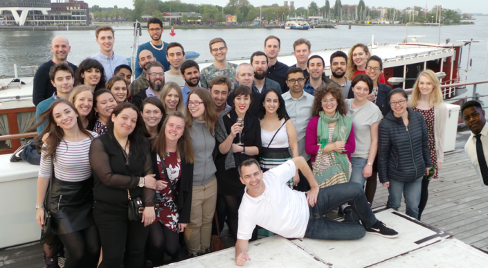
On the 23rd of June 2015, there was a spark in Central London.
And two years later, this spark is now a burning flame, which has been a roaring success.
I am, of course, talking about the Data School.
An idea started by Tom Brown, Craig Bloodworth and (perhaps the most important piece of the jigsaw) Andy Kriebel ended up in eight complete strangers taking a leap of faith and joining an immersion programme like no other. It promised four months of training in two market-leading data analysis applications, followed by 18 months of consulting at clients of the Information Lab.And it worked.
It really, really worked.
Quantify This.
5 cohorts trained (DS6 are currently in training)
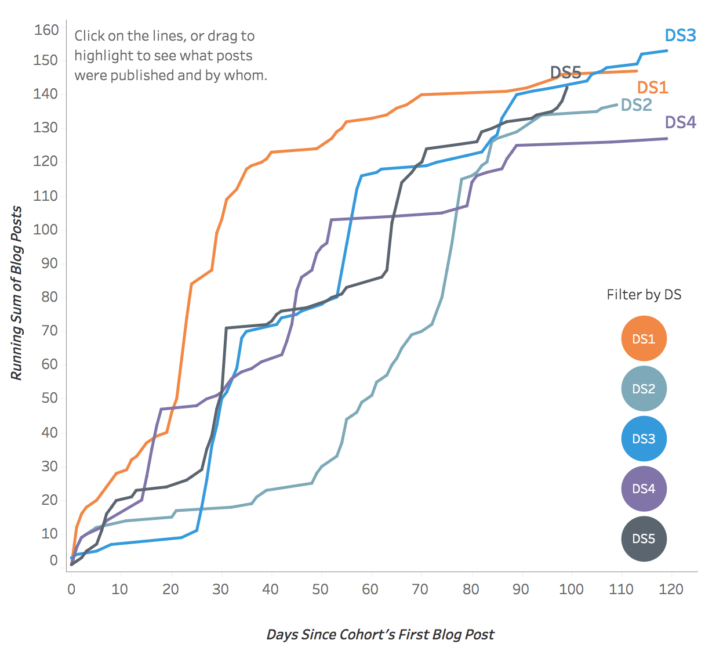
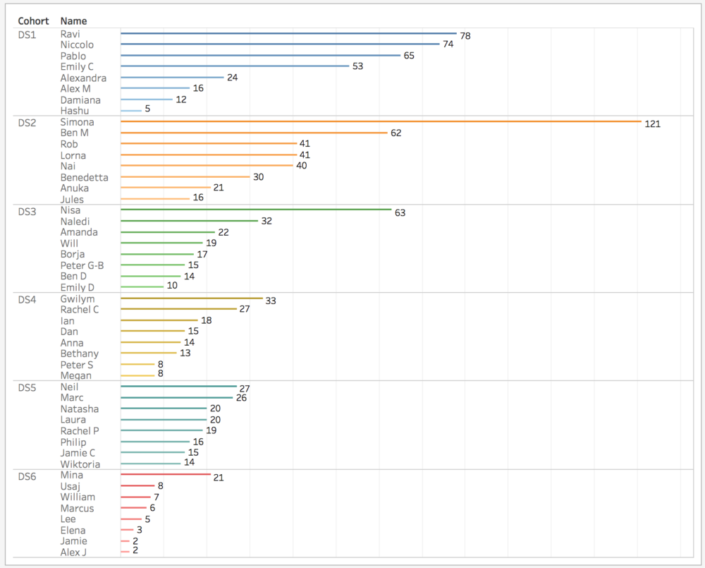
702 blog posts
1238 Tableau Public vizzes
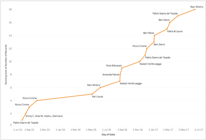
18 Viz of the Days
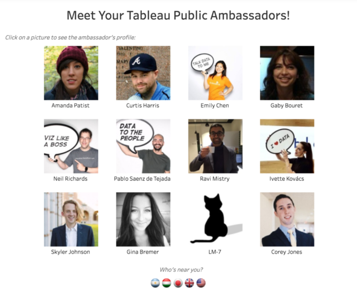
4 Tableau Ambassadors
The Experience
For me, coming out of university, I had no idea of the size and impact that the Data School would have. In fact, Tableau was simply a tool which made my soccer charts look better, and made them more dynamic. Anything more than that (I thought at the time) involved some crazy coding - so I endeavoured to up-skill in the summer after university anyway, but in the end I was lucky enough to be offered a job with The Information Lab.Between the numerous client projects, the public presentations (I've now done 7 public presentations - 3 webinars and 4 in person live) and the amazing expansion of my personal and professional networks, the opportunity to work and consult with the Information Lab has been great. My three placements were at BCG, Deloitte and Novartis (who are based in Switzerland!), and each experience lent itself to another learning experience.
At BCG, I built, ran, and developed training materials whilst balancing case work where we supported consultants. At Deloitte, I experienced the breakneck speed of being part of a consulting team with hard deadlines, iterating on the fly. At Novartis, I learned about strategically building out a Centre of Excellence, and supporting the development of enterprise scale rollouts of both Tableau and Alteryx, as well as the challenges that come with that.
And alongside all of this, the continued personal development, time management and extra-curricular activities have been paramount to getting me where I am and making me who I am today.
The best part? From day 1 with the team, I was assigned Brian Prestidge as my mentor - a true gentleman who spent nine years working in football using Tableau and Alteryx. The soft skills, application, and anecdotes from him were fantastic, and the opportunities which came from sharing my interests also helped my development. I attended two OptaPro forums, and developed my own style of sports dashboards which are both informative, beautiful, and applicable to different audiences, and of course, who can forget the Data School's #TeamIago who attended Hack MCFC.
Now.
Since finishing the Data School, I was lucky enough to be offered the opportunity to join The Information Lab as a core consultant. How has this changed what I do day to day?In all honesty? Not all that much. I'm still consulting with clients, but instead of one client for six months, I'm working with three clients in a week, six in a month etc. It's a really fast-paced role, and fortunately there's still the opportunity and time for more learning. In fact, I think I've learned so much in the last couple of months, purely given the wide breadth of clients I've worked with, as well as having the time allowed to reflect and develop.
My final thoughts are this; in June 2015, along with eight strangers I embarked on a two-year journey.
At the end, I've gained friends, colleagues, and the job of a lifetime - and it's just the start.
A particular highlight is where I found myself, in the middle of July 2015 sitting working on a client project, or a dashboard and thinking - hey, three months ago, I was doing this for fun.
Now it's my career.
The Data School; 2 years on.
Anonymous
09:00
No comments
![]()
On the 23rd of June 2015, there was a spark in Central London.
And two years later, this spark is now a burning flame, which has been a roaring success.
I am, of course, talking about the Data School.
An idea started by Tom Brown, Craig Bloodworth and (perhaps the most important piece of the jigsaw) Andy Kriebel ended up in eight complete strangers taking a leap of faith and joining an immersion programme like no other. It promised four months of training in two market-leading data analysis applications, followed by 18 months of consulting at clients of the Information Lab.And it worked.
It really, really worked.
Quantify This.
5 cohorts trained (DS6 are currently in training)

702 blog posts

1238 Tableau Public vizzes

18 Viz of the Days

4 Tableau Ambassadors

The Experience
For me, coming out of university, I had no idea of the size and impact that the Data School would have. In fact, Tableau was simply a tool which made my soccer charts look better, and made them more dynamic. Anything more than that (I thought at the time) involved some crazy coding - so I endeavoured to up-skill in the summer after university anyway, but in the end I was lucky enough to be offered a job with The Information Lab.Between the numerous client projects, the public presentations (I've now done 7 public presentations - 3 webinars and 4 in person live) and the amazing expansion of my personal and professional networks, the opportunity to work and consult with the Information Lab has been great. My three placements were at BCG, Deloitte and Novartis (who are based in Switzerland!), and each experience lent itself to another learning experience.
At BCG, I built, ran, and developed training materials whilst balancing case work where we supported consultants. At Deloitte, I experienced the breakneck speed of being part of a consulting team with hard deadlines, iterating on the fly. At Novartis, I learned about strategically building out a Centre of Excellence, and supporting the development of enterprise scale rollouts of both Tableau and Alteryx, as well as the challenges that come with that.
And alongside all of this, the continued personal development, time management and extra-curricular activities have been paramount to getting me where I am and making me who I am today.
The best part? From day 1 with the team, I was assigned Brian Prestidge as my mentor - a true gentleman who spent nine years working in football using Tableau and Alteryx. The soft skills, application, and anecdotes from him were fantastic, and the opportunities which came from sharing my interests also helped my development. I attended two OptaPro forums, and developed my own style of sports dashboards which are both informative, beautiful, and applicable to different audiences, and of course, who can forget the Data School's #TeamIago who attended Hack MCFC.
Now.
Since finishing the Data School, I was lucky enough to be offered the opportunity to join The Information Lab as a core consultant. How has this changed what I do day to day?In all honesty? Not all that much. I'm still consulting with clients, but instead of one client for six months, I'm working with three clients in a week, six in a month etc. It's a really fast-paced role, and fortunately there's still the opportunity and time for more learning. In fact, I think I've learned so much in the last couple of months, purely given the wide breadth of clients I've worked with, as well as having the time allowed to reflect and develop.
My final thoughts are this; in June 2015, along with eight strangers I embarked on a two-year journey.
At the end, I've gained friends, colleagues, and the job of a lifetime - and it's just the start.
A particular highlight is where I found myself, in the middle of July 2015 sitting working on a client project, or a dashboard and thinking - hey, three months ago, I was doing this for fun.
Now it's my career.
Monday, 1 May 2017
Iron Viz Europe: Changing Demographics Across Europe
Anonymous
13:38
ageing population, dashboard, data viz, demographics, eu28, europe, iron viz, ironviz, tableau, visualisation, vizualisation
No comments
![]()
6 days ago, I tweeted out this picture of my work-in-progress dashboard. Below, is my narrative on how it was built.
Iron Viz season is well, well, well underway. For the first time, Tableau Public are running Iron Viz Europe - Think #TheBigOne, but on a smaller, more concentrated scale.
I entered my first ever Iron Viz for the first feeder this year, looking at National Parks in the UK, but the topic for the inaugural Iron Viz Europe was simple; Europe. Any data, any topic - but it has to have a link to Europe.
Now, there's actually a surprising number of data portals in Europe, and quite a few with good, clean data. I submitted a piece of work I did a few months back on EU GDP Growth, and following a similar thread, I decided to focus on something based around the EU28 countries.
I'm a semi-regular reader of the Economist, and one article which I read last weekend caught my eye - "Immigration cannot plug the hole in America’s budget". Within this, it detailed that America's ageing population would mean greater pressure on the working age folk to take on responsibility + productivity - and to solve this with immigration, I quote..
A rough calculation suggests that almost 40m such immigrants would need to arrive immediately in order to fill the hole caused by social-security payments and hospital visits for the over-65s. They would have to be followed by 36m more by 2047—arrivals that are already baked into budgetary forecasts.
Now this lead to a discussion with my uncle, who quoted something about how fertility rates would have to be maintained around 2.0 to sustain a culture through a generation. Coupled with the article, I wanted to take a look deeper for myself.
For this, I used the World Bank Dataportal. This has a whole host of development indicators and macroeconomic data open for use. I took a handful of metrics, and then got to work. Through the #TableauShuffle, and some data exploration in Tableau, I figured what I wanted to show is how much things had changed. The data I had extracted I'd taken from 1984 (as this gave the most complete data for all the EU28 countries) up to 2014/2015 (some metrics didn't have data for 2015). Small multiple with text was my original idea, and I very quickly had a rough visual in my head of what I wanted to do.
 |
| A calculations I use often, but can never remember. |
First, I thought of using the "Columns/Rows" calculations (which I save in my OneNote cos I can never memorise it) [For reference; Column Divider: (index()-1)%(round(sqrt(size()))) Row Divider: int( (index()-1)/(round(sqrt(size())))) - then make both discrete dimensions and have them compute using the dimension you want to split into small multiples).
 |
| Hmm.. Not enough whitespace for me |
This trick is one I love, but it was too crowded for me. I wanted my small multiples to have space to breathe. So I took 2 unprecedented steps;
- I decided to use floating containers.
- I decided to create a long form dashboard.
I've been (perhaps fairly publicly?) against long-form visualisations, mainly out of laziness and effort placed on the reader. I think it's a difficult skill to build out a long-form viz, while also maintaining a strong rhythm - particularly balancing an emphasis on design vs and emphasis on information.
Nonetheless; I wanted to do small-multiples here, and I wanted to tell a story. So I began designing my dashboard and working out exactly how long my dashboard should be, how many elements I want and how to lay it out. The tools I used for this were; Microsoft Excel to plot where 28 countries would sit, and how much space a title, a line chart and stacked bar would need.
 |
| How to scientifically figure out what goes where on a floating container dashboard |
Magical.
Now here's the interesting part. What I started with is an idea where I had the EU28 average in the middle, and all the countries around it. But this was waaaay too fiddly, and I wouldn't be able to use one y-axis as I can with this finished product. Below, you can see what I started off with as my first pass.
As things moved on a little, I found that I needed a touch more space in my visualisation. So, given I've plotted the exact position of my containers, said exactly the height, width and layout - These should all be fine right?
Wrong. Tableau shifts all these down - I've added it to the list of questions I have when I grab a dev at the Tableau Conference in Vegas this year. That, and a font issue I'll cover shortly.
As you can see, layout, colour scheme and background have all changed - and this is thanks to the waves of feedback I got; not only from those in the Data School, the Information Lab (UK and beyond!) but also from members of the Tableau Community. Y'all rock. Thank you!
The final touches for me was to clean up the "how to read" legend - Ben Moss was a big help here by suggesting I combine the image I'd mocked up with the EU average visualisation, thus leaving me with more space to play - and the final three panels at the bottom. I called these "quick hits" - thought they're more like little blogshots. As as well as changing proportions within the EU28, I wanted to focus upon the fertility rate (ie. how many babies we're having) and the dependency ratio - ie. which countries' labour force have the highest burden upon them.
Finally; the font. I used Segoe UI throughout this, however I noticed some strange behaviour when I uploaded to Tableau Public - The text boxes, titles, are all Segoe UI, but the axes and labels seem to revert to Times New Roman (or whatever the default font is) - This lead me to change it to Arial, for consistency.
Conclusions
This is the first time I've used floating components in a dashboard and created a long form viz. While I understand the reason that they are popular, as a designer I don't have the patience or the mindset to regularly create these - particularly given the control (or lack of) that Tableau provides.
While I can't envision that I'll create a long-form for a long, long while - I'm glad I pushed myself to try something different for this Iron Viz entry; particularly for a topic and story which I am fairly passionate about.
To view the viz, follow this link; http://tabsoft.co/2p58rM0
Or check out the image below.
Thursday, 23 March 2017
Organising Data Projects - Intro, Folders and Files.
Anonymous
08:30
data viz, documentation, file structure, folders, organisation
![]()
However, what I’ve often found is the way these projects are stored, particularly for collaborative working, are grossly lacking in proper organisation. Now I won’t sit here and pretend that I am an organisational messiah - I am perhaps one of the worst culprits for disorganised folders. I mean, I could probably do a whole post on the number of random half finished projects I have lying around on my desktop.
So the purpose of this mini-series is simple; to talk about how to organise files, documents and data on a shared workspace. No doubt, there are a number of systems I won’t mention, options I’ll present which aren’t as successful - It’s easier to find something that works for you.
Folders
First in this series, I’m going to talk about folder structure. The most obvious question is this - why would you even both setting up a folder structure?Well, it physically hurts me when I see Desktops which look like this...
I mean, talk about airing your dirty laundry in public! At least shove it all into a “New Folder” and forget about it completely (this is my preferred method of non-organisation)
In reality though - the reason for organising your PC isn’t purely about being OCD. Having a structure of how to organise your files and folders with an actual system will make project management, and even just life management that much easier.
And think of this this way; even just grouping similar files is one step closer to finding something when you go hunting for it. Of course, nowadays there’s rich natural text search, but I think it’s a good habit to at least try to form. Plus, it’s easier to rapid delete a whole folder of trash/useless than having to multi-select.
Stop using the Desktop as a dumping ground.
While it’s stupidly easy to get into the habit of “quickly saving to the Desktop” - mainly cos its the easiest place to drop something and pick it up - it’s worth getting into the habit of cleaning your desktop as part of your ‘log-off’ routine. By this I mean either filing the files on the desktop away into a file, or deleting what’s used. This is hard to do, especially when you’re unsure if you’ll need something in the short term. Personally, I make a “archive” folder on my Desktop which I delete/reorganise when I find some time each week.Figure out a structure, stick to it.
The hardest thing is thinking of a structure. It’ll come naturally - but first, start thinking in hierarchies - what factors go together, which don’t etc.How does this work? Let’s take an example of a hierarchy;
As you can see, the "root" folder is a generic field, split by genre, by film series, then specific film. Getting into this mindset can be tough, but the way I approach is it a spring clean every now and then to make sure that I'm on top of my organisation.
Giving your files random names - Just, no.
I'll touch into this again in later posts, but the crux is this - For spreadsheets, I have countless "Book1.xlsx" or "test.yxdb" or "final_version.tde" etc etc all over my laptop. The issue of course is when you want to organise your documentation, and think about handovers - you have to open each one, rename, check what breaks when you delete it... organisation and having a set "process" helps this, and can set a sustainable precedent for the future.Think up a naming convention - How do you want to name your data files? How should you name your workbooks? What moniker should raw supporting documents have vs. ones which you've amended? Methods such as adding the date beforehand (ie. 20170321_Project X.tde) or starting to use a "version" suffix (ie. ProjectX_Output v1) - though, a warning from personal experience.. if working in an agile way with continuous iteration, this could become a long, long version list. Using a date structure means that files also remain in an chronological order when you're using them.
An interesting tidbit about spaces in filenames I wasn't aware of (though this may have changed in newer tech) is that using dashes (ie. -) and underscores (ie. _) are better than "spaces" as some software have issue reading spaces. Check out this link for a bit more information.
https://library.stanford.edu/research/data-management-services/data-best-practices/best-practices-file-naming
How does this work with data?
Project: This is the highest level of the hierarchy, which as mentioned should have a clear name which is obvious and easy. If working in a more ”agile” manner, this can be the level where a sprint or v1 is kept.
Project Docs: Any documents which are supplementary to the project, be it presentations, data definitions or similar.
Alteryx Modules: Within this, the user can split as required - having the workflows (.yxmd files) stored in one folder, intermediate data (here meaning .yxdb’s or input files) as well as another folder for macros.
Tableau Outputs: Workbooks and .tde files can be stored here.
Whatever else is required: Project by project, this can change - One which could be added is “Raw Data” as well as ‘inputs’ and ‘outputs’. User discretion comes into play here.
What’s next?
As I alluded to above, ultimately this blog series is going to be about how to document your data processes, and sharing examples of practices (note the lack of "best" before the word) which can be used to ensure that data projects are communicated clearly and in a structured manner.Given the tools I use day to day, I’ll mainly dive into both Tableau and Alteryx to explain methods of handover and documentation for those two tools. The methods, however, may bee transferable between softwares.
Monday, 20 March 2017
Iron Viz: Geospatial Contest - National Parks in the UK
Anonymous
21:34
data, data viz, geospatial, iron viz, national parks, parks, tableau
No comments
![]()
There's nothing overly special about my Iron Viz entry.
Iron Viz actually is one of the biggest stones I tripped over to find myself within the realms of Tableau, Alteryx and eventually, the Data School UK. Entries from Neil Charles, Steve Fenn & utlimately the gorgeous visualisation from Chris Love (which lead to me following him on Twitter) for the Wikipedia data contest were the happy twists has taken me to where I am today.
This is the first Iron Viz contest I've entered - I've thought about entering the past 6 (six!!) feeders, but ultimately haven't either created or submitted anything. This time I thought I'd have a proper go.
Spatial: The Final Frontier
Tableau 10.2 brought .shp files as a native connection, and thousands of cartographers rejoiced. For me, it meant smaller problems could be solved in my day to day job, but I've never gotten deep into spatial data.
The value Tableau brings to the market & to us as data practitioners is the 'easiness to use'. For me, this means showing and sharing how something doesn't have to take a ton of time or effort to build or reproduce. So last Wednesday (15th), I set about hunting for some .shp files. I dug a few places, and found myself on the UK's Office of National Statistics Open Geography Portal (https://geoportal.statistics.gov.uk/) - This is a treasure trove of shapefiles, but for me things like OA, LSOAs, Electoral regions.. it was stuff that was easily done + not an interesting topic.
Areas of Outstanding Natural Beauty
For those of you who don't know, there are certain areas in the UK which are designated the title of "Area of Outstanding Natural Beauty" - I've always found this funny, but it gave me a brain wave - What about the National Parks in the UK? So I jumped in, found the shape files - and just as you'd expect, bringing this data into Tableau was dead easy. Like, stupidly easy.
The Simplest Form of the Viz
As I mentioned above, I'm a huge believer in making this easy & not having to resort to workarounds. This is when I decided not to screw around with this Iron Viz entry (which, I found, was a fools errand) and that this was the only shapefile I wanted to use. That's it. I was done. No QGIS, no blending of shapefiles in Alteryx - Let's just use public data and connect it to Tableau and boom. I'm away.
The issue, of course, for me came down to the data. There were a lot of statistics, facts etc - But I hadn't properly hunted for the right dataset. Now, with this Iron Viz, the options were of course to look for the data first, then the shapefiles second - or do it the other way around. I spoke with my colleague Valantis about this earlier - I don't think there's a right answer here at all.
I played with Mapbox a little, before choosing a pre-made map for my background, and then added some numbers to supplement the data.
On Wednesday evening, I thought I was basically done. Here's what I had.
Boom, I thought. I'm done. I sent it to a few people - and got some feedback. But I swore to not do anything, and just make small changes. One of them told me - "If you wait until you are 100% happy with it, you will hardly sleep for 2 weeks." - It's truly an addiction.
Let me share with you the iterations I went through since this one...
Before finally...
Phew!
What a ride.
The Viz
So what's the purpose behind this visualisation? It's effectively an infographic which details the parks in the UK which are given the name "National Park" - This means that the Government has classed the area as one of conservation, where the residence, development & treatment of the area is protected and maintained through funding and support by the local governments. It also explains how vital the parks are, through tourism and also supporting seasonal jobs within the local areas.
I wasn't able to find data which fitted this theme, so ended up going for a semi-interactive visualisation with information through both text and through key metrics. One thing I did consider doing is adding a "rank" for context, however, I wasn't certain whether this would clutter the viz so ended up leaving it out. Another thing I thought about adding was a picture in the bottom left which was dynamic, showing a gorgeous image of the selected park. Perhaps next time!
Conclusions
Iron Viz is an addictive challenge. Similar to the Tableau Public Hackathon, it challenges you to think of a topic under a time constraint and hunt for relevant data in order to create something. Anything!
I would LOVE to hear feedback on my visualisation, and ideas on the theme. It was the design + formatting which took the longest, and I finally settled on the charcoal + white combo after I got my Dad to have a look at the viz to see which colour he thought worked. Neither, he said, make the background white.
Thanks for reading!
Saturday, 28 January 2017
QS3 - Sleeping in December
Anonymous
21:52
dashboard, data, data viz, fitbit, quantified self, sleep, sleep data, tableau
No comments
![]()
For the month of December, I looked at my sleeping patterns. Since about November 2015, I've worn a Fitbit most days. I own a Fitbit HR, so my sleep is automatically logged. Now, one small thing that annoys me about Fitbit - actually, it's kinda big, but I hate the fact you can't easily access ALL of your data. Of course, this is probably possible through an IFTTT recipe, or accessing the API to get the data you need - but things like my heart rate, or my hour by hour steps... I can't easily download that! Like, what the hell Fitbit - This is my data!
</end rant>
So - I downloaded a months worth of sleeping data from Fitbit's website, and connected it to Tableau. I spent a good amount of time on the #TableauShuffle stage with this month's data. I couldn't decide whether I wanted a connected scatter plot, a Gantt chart.. In fact, let me show you what the connected scatter looked like..
It's a bit of a mess, with no real trend! I guess I didn't choose the moniker of "scribblr" for nothing...
Anyway, as a side note, sleep efficiency is a calculation which Fitbit define as..
"We use the following equation to calculate your sleep efficiency:
100 * time asleep
/
(time asleep + time restless + time awoken during sleep)"
It was an additional metric I added as it's on my Fitbit dashboard.
This project almost got to a stage where I was just going to publish the classic bar, line, scatterplot combo of charts on a dashboard. But then I started thinking about the Fitbit dashboard. If I wanted to create a month view, what would I want?
So I started playing with calendars.
As you can see on the right, this is such a basic chart, but it still told me more than I knew from the scribbles up top.
Now this project was to try different things - So I didn't want to go *too* tried and tested, though this dataset was grating on me (an interesting thread which I read on Twitter earlier today talks about this, ending with this tweet from Chris Love here)
I wanted to add a bit more information within this, but also have different formats. Now, the end results could have easily been done in one label.. But I had a go trying a new way of formatting.
From here, I didn't think this could be a viz. It's a glorified formatted table! So I looked around the internet for some inspiration, but a lot of "sleep data" based visualisations are line charts, or dot plots. It's not an inspiring dataset it seems - Unless it's this one where a Dad visualised his daughter's sleeping patterns for the first 6 months of her life. I couldn't figure how to reviz it, but it could be something cool to come back to another time.
The next steps was simply plot my daily sleeping pattern day by day. Here I tried something different - instead of having an axis, or labels, I used reference lines to show the maximum and minimum, and customised the tooltips so it could be investigated later on.
The finishing touches were of course my favourite "metric cards" along the top, with some headers to spilt the dashboard up slightly.
Let me know what you think! (click to navigate)
Saturday, 21 January 2017
Fair, or Foul?
Anonymous
14:31
analytics, cards, data, football, fouls, referees, soccer, sports, tableau
No comments
![]()
Referees have a damn hard job in football, and the last few weeks, with Mike Dean being "demoted" (how does this even work? how is working in a similar environment, with perhaps more incidents per game in the Championship work? why is this a demotion? The answer, as ever, is money, power and exposure. But I digress) the work referees do and how they perform is increasingly important.
There's a couple of things which have been on my mind lately, and it stemmed from someone in the Analytics community (I spent a bit looking for the actual tweet in question, but couldn't find it...) saying how Ander Herrera is notoriously effective at fouling multiple times without picking up a yellow.
Within this, I've look at fouls/fouled per game, yellows and reds per game as well as the number of fouls committed for every card received. Let's get stuck in.
I'll post the dashboard here, and if you scroll down, you'll find discussion points from me, with a few screenshots.
The first story point (there are two, one in each tab along the top), focuses on a scatter plot. This contains every team from every league mentioned above for this season (before the round of games for the weekend of 21st Jan 2017)
On one axis is the cards per game, and the other has fouls per game. Tab through and find your own team, and compare it across the leagues.
The second set of charts is the dot-plots, and I've added a median line, with an confidence interval of 95%. These I've gone through in a bit more detail below.
Fouls per Game
When we look at fouls, we then have to look at how trigger happy referees are when pulling out their cards. La Liga has the highest number of cards awarded across the league, whilst referees in the Eredivisie and Ligue 1 1.5-2 cards per game.
Fouls per Card
The danger here, of course, is inferring that teams which foul and are carded less are lucky, and those who foul less and are carded more and unlucky - what if the latter have some tough tacklers who often make bad challenges? What if the former are pushes in the back, and body checks by various players across the teams. This is where the data should be investigated to explain the phenomenon. Drilling down to player level will support this.
What's the point? Where's the value?
With any sort of data analysis, particularly in sport, there are two key questions. The first is, what's the point in doing it? The second is, if this is useful information, how can we use it to our advantage as a team?
The answer to the first question is simple; there are certain teams across every league with a style of play where tactical fouls are common. Is this because of their aerial style of football? That they play with 2 robust central midfielders or defenders? Or are they simply bullies, who have the ability to shut down flair players through sheer physical player.
This doesn't even start to answer those follow up conversations or questions, but it does do something quite key - it starts those conversations. It gets people thinking from a set of basic metrics which are easy to understand. And this is where true buy in can begin within clubs, and indeed, within fan bases.
As a team, the advantage of this information would be for a pre-match scouting report. How can this help us identify the style of play that the team plays? One step further... Who are the key players who help them play like this? Again, basic analysis breeds the desire for more context to inform better, smarter decisions - and in a shorter space of time. And further? Once you start getting a good idea, a smart analyst would begin to look at manager styles (hat tip to Statsbomb Services who advertise that they do this sort of thing), and then even look at referee styles & data, to see if that can be gamed. Edges and gamification of league rules.. That's the way sports teams get ahead, right?
Have a play with the dashboard above, and do be in touch any thoughts, ideas or feedback.


